UX & Website Design
Healthy Port Futures
Overview
Healthy Port Futures came to our team at Pixel Parlor in search of a website redesign. They wanted to elevate their site to showcase projects and clearly portray who they are and what they do. We created a site that demonstrated who they are and visually guided users through their projects in a compelling way.
Agency: Pixel Parlor
Collaborators: Cavallo (Development)
Discovery
In the discovery phase we learned more about our client through their survey responses. This included aspects such as their mission & vision, their goals, their target audiences, and pain points they were experiencing with their current site. We also went through a competitive analysis which we helpful to see what the client did and did not like.
Goals:
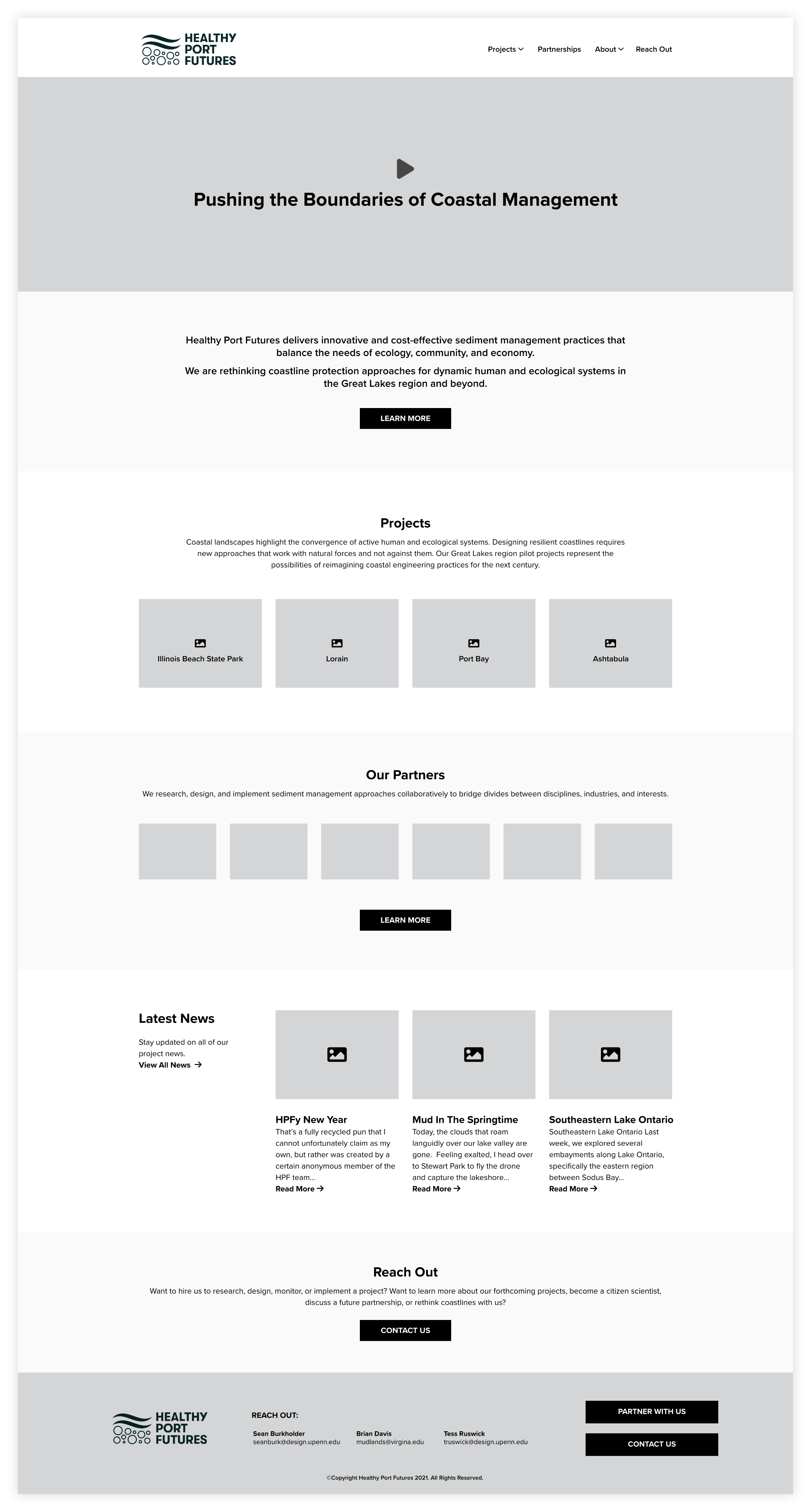
Promote the work they have already done in an interactive and visual way.
Increase leads for new work and funding
Increase community interest
Utilize new branding
Sitemap & Wireframes
After learning more about the client we created a sitemap to better organize the information they wanted to include.
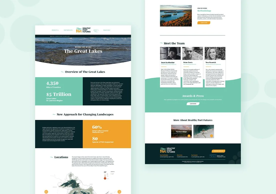
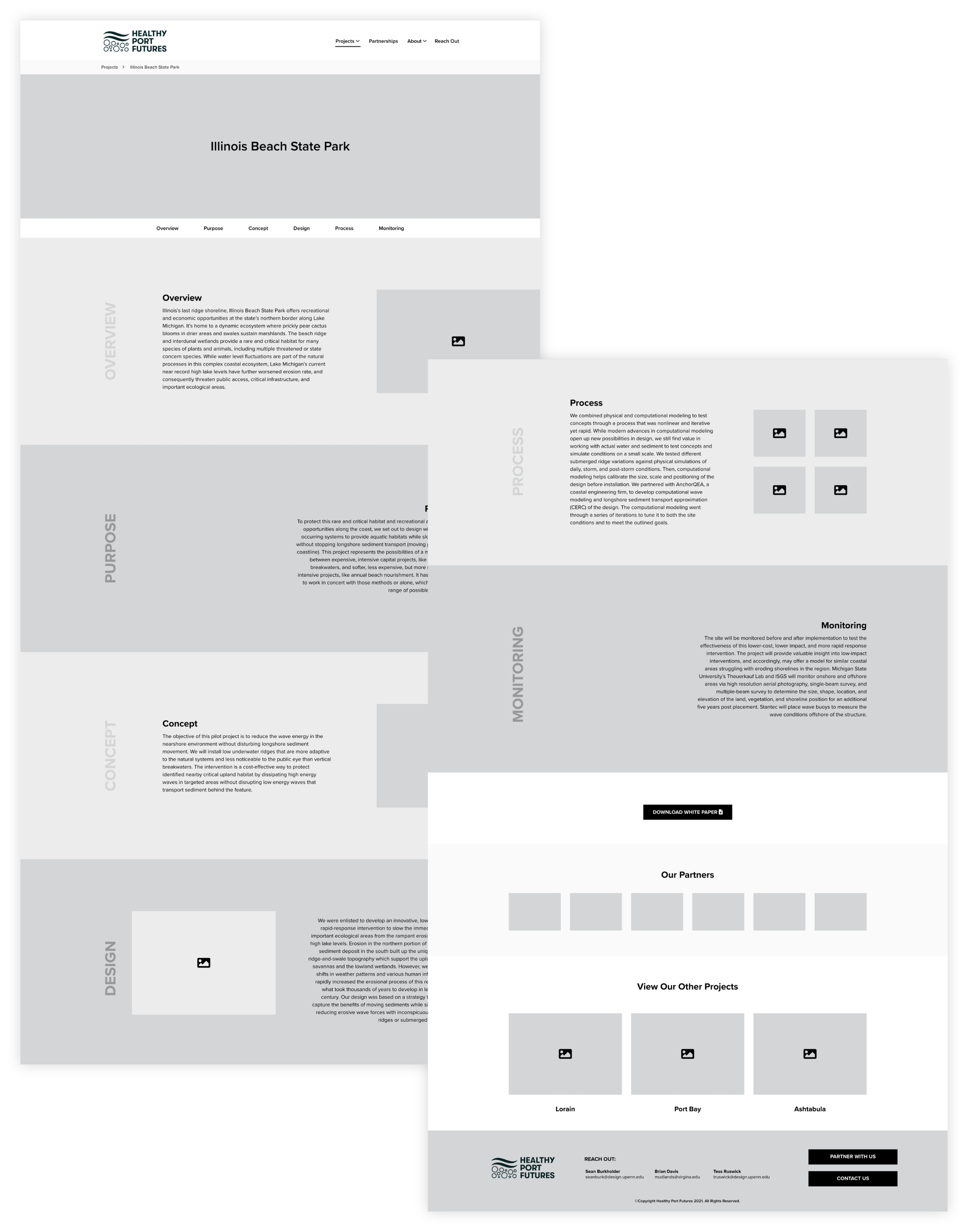
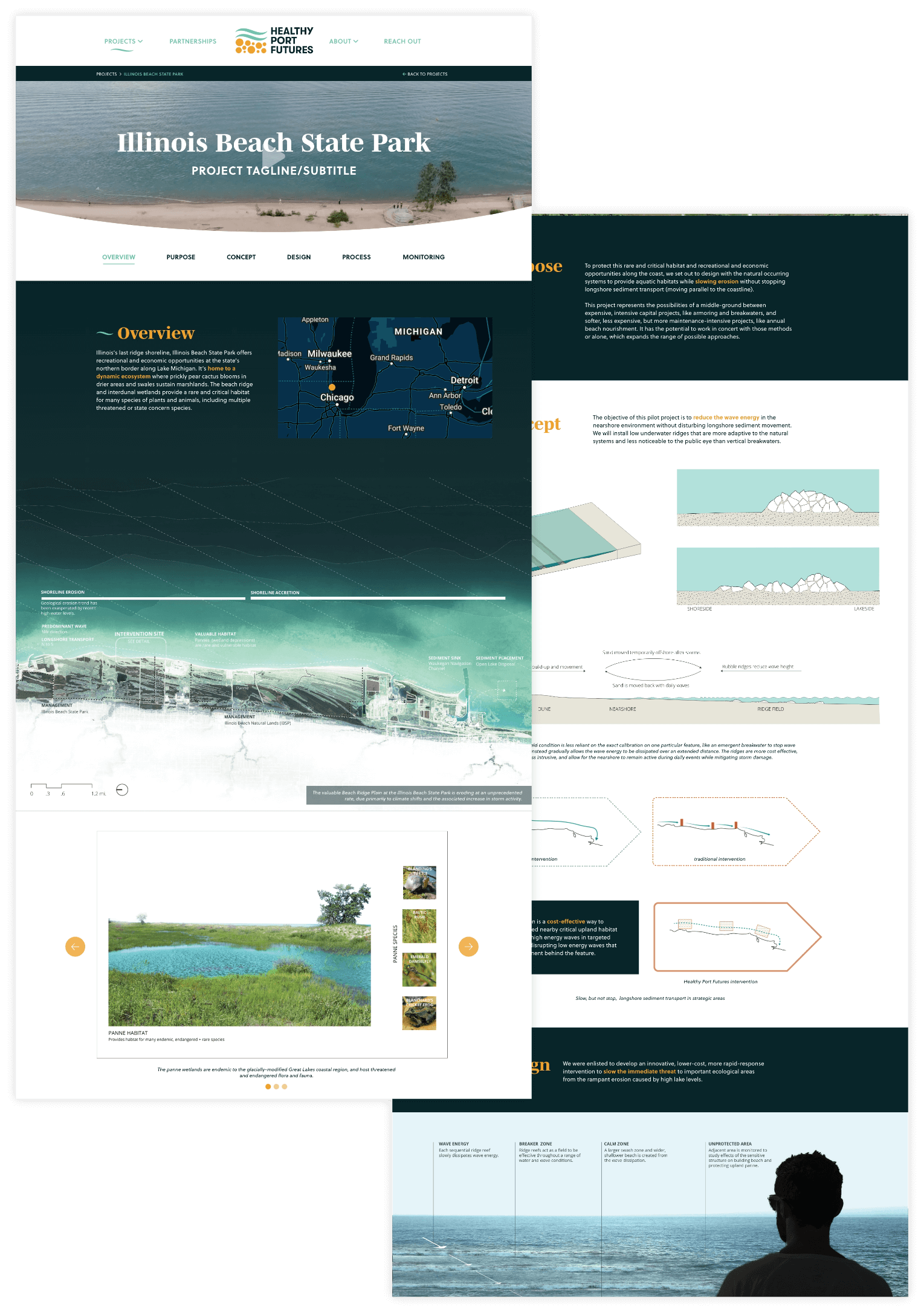
Then we started creating wireframes for different templates we would be using on the site. The individual project pages were definitely the biggest challenge to problem solve for. These pages were content heavy and technical so it was important to create an experience that kept the user scrolling. We also wanted to be able to keep them consistent while also accounting for each project having slight variations in content.

Visual Design
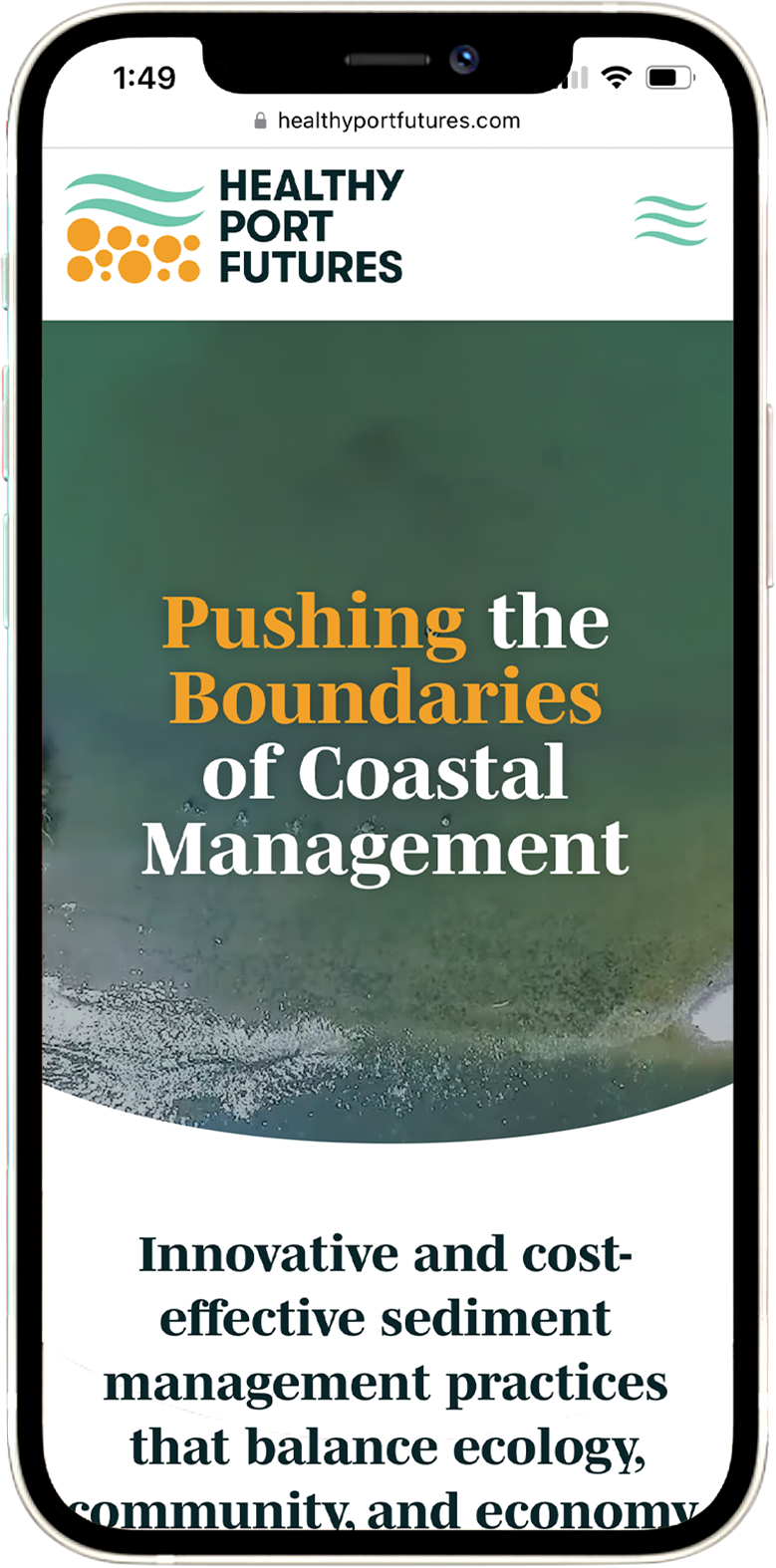
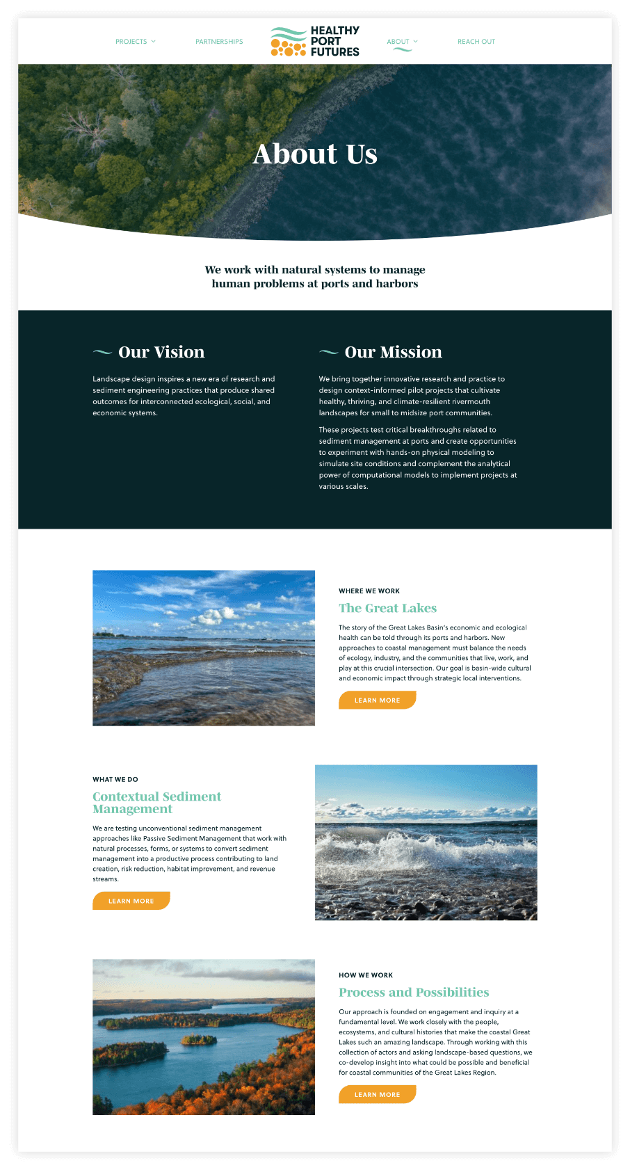
Once we moved into visual design we utilized the new logo and brand guidelines created by our Brand team. We pulled in pieces from the logo such as the waves and circular elements to give it a strong brand identity.
Progressing the individual project pages from the wireframes to the visual design was a big piece in this phase. To keep the user engaged we wanted to use large imagery, negative space, and factor in some room for parallax to encourage users to keep scrolling. We broke the content up by mixing in imagery and occasionally creating text boxes layered over relevant imagery so the user could easily follow along.
Development & Training
In the development phase we worked out some of those scrolling image effects on the project pages by collaborating with the development team.
Once the site was tested and launched we trained the client on how to use their new site so they could update as their projects continue to grow.
More Work
-
Weston Solutions
-
PA Humanities